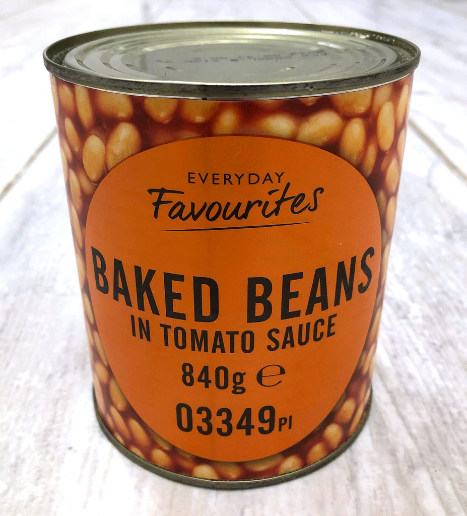
I decided against joining the Coop Corona queue this morning and dived into the little Premier next door. As I browsed the shallow shelves my design eye was immediately drawn by the double-size baked beans tins.
Big, bold, easy to spot, everything I need to know right there on the packaging.
It’s not trying to be pretty and add value. Beans in tomato sauce are beans in tomato sauce.
It’s not trying to be clever. Choice of colour, obvious. Font choices, unremarkable (the letter and word spacing are a typographer’s nightmare).
This certainly won’t win any awards. It doesn’t matter, because it does the job it was designed to do. You can’t miss the presence. The design is so simple, because what it needs to say is so simple.
It looks and feels real. Not real in the ‘authentic’ mode of story-telling. Real in that this is what it looks like spread all over your toast!
Tell me, what more does the customer need to know about this product (unless you’re checking sugar/salt)? Everything is laid bare. Take it or leave it.
Sometimes graphic design doesn’t need strategy, deep thinking or beautiful layout.
Sometimes we just need straight-forward, functional, this is what you are real-ly getting.