A logo design by definition should have a unique visual form or element. Simply typing a business name in a font does not make it a logo. Why? Because if another business types it’s name in the same font (or typeface) where is the visual differentiation? The same graphic appearance essentially communicates that these two are the same. No distinction, no personality, no difference. The polar opposite of what branding is all about.
A useful logo design guide or principle is customise the letters (or type as designers say).
A Working Example
Below is the sequence from the logo design development for a photographer, Drew Walker.
Drew has a relaxed, easy going personality. Much of his work is about nature and the great outdoors. So, the goal was to create a logo that says:
- Relaxed
- Nature/natural.
- Photography/focus.
As we look through the development phases we’ll see how stylising the letter forms and changing the arrangement moves the text from generic to specific, giving it a new character.
#1 Starting Point

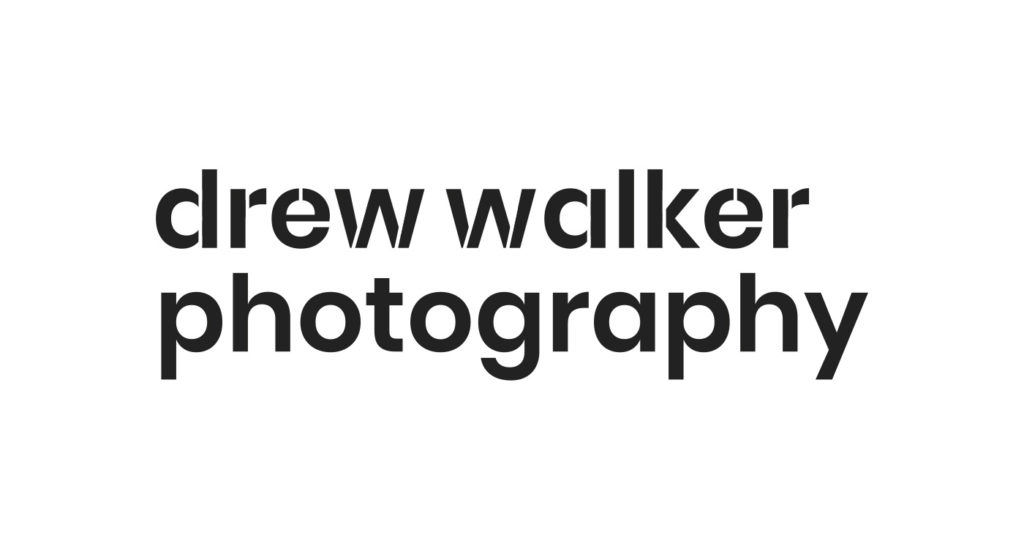
Here is the business name written in the widely available Google Font, Poppins.
At this point, this isn’t a logo. It is just text. There is nothing individual or distinctive about it.
Sure, the font (typeface) is clean, open and feels modern.
Everything in lower-case suggests an appropriate informality.
But, anyone can reproduce this, in about 1 minute, for free.
#2 Stencil Effect

Immediately the name has a different character to it.
We are creating something new.
#3 Rounding

All of the letters now have slightly rounded corners. Knocking off the hard edges softens the visual. It is a minor iteration (compare closely), yet it is still creating the desired effect and has taken the letterforms a further step away from the widely available standard font.
#4 Hierarchy

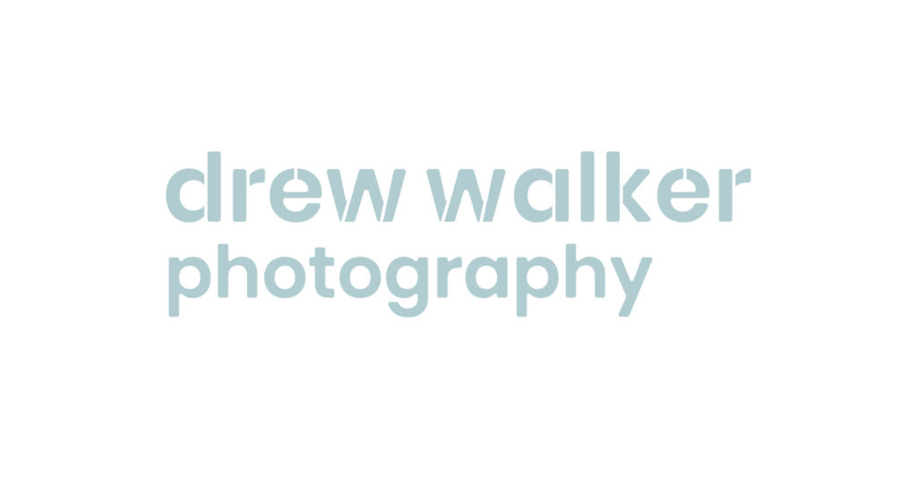
Changing the size of textual elements changes the relationship. The name part, drew walker, is the most important part. So it is bigger.
This change is supported by the use of the stencil on the name. There are now two elements working in conjunction, telling us to pay attention to the drew walker part (because that is the brand difference, you get Drew).
#5 Symbol

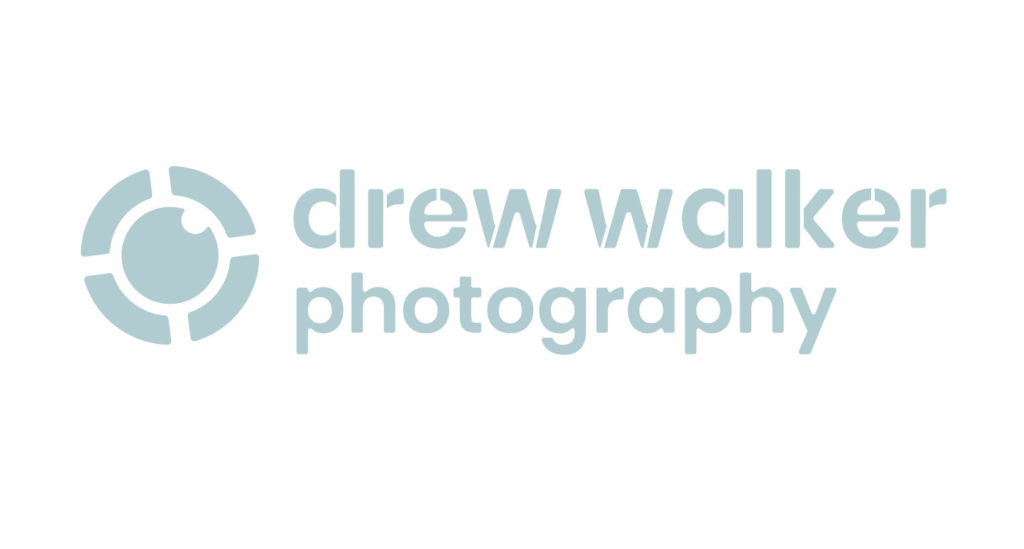
A bespoke symbol adds an additional pictorial element. Yes, this is non-typographic. However, the stylisation started in the letterforms continues in the symbol, unifying the two elements for a congruent whole.
Takeaway
If we compare #1 to #5 we can see a number of differences that shift the letters from a font to a logo. It is not dramatic or radical. It is simple and effective.
Looking for more logo design guides? You’ll find more articles here.
Want to know what makes a good logo design? Watch this.